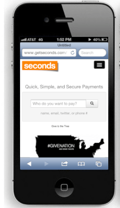
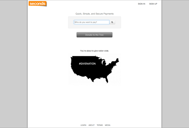
Fred Wilson has written extensively on designing for mobile first, desktop second. I couldn’t agree more and that is exactly what we are doing at Seconds.
 When looking at our initial user interface design of both the mobile view and the web view, one will see quite a few similarities. This is not by accident, this is because we start with the mobile view first. We first ask ourselves which mode most people will use our service, mobile or desktop? Given the fact Seconds is a payments platform oriented around mobile devices, mobile takes highest priority.
Also, the fact that more smartphones are shipping than feature phones and the estimation by 2017 is the majority of web traffic will come from mobile, we feel designing for mobile first is a safe bet.
Finally, it’s such a pain to view a website on a mobile device only to have to pinch and zoom to even read the content and click the desired button. We feel it’s better to design for the smallest screen and allow the larger screens to pull the content/visuals out. It’s the reverse perspective of the pinch and zoom experience you mostly see today.
So, if take a look at our desktop web presence you will see pretty much the same information and visuals, just aligned slightly differently since there’s quite a bit more real estate.
How did we do this? Did we use a different service to create a “mobile optimized website” to augment our desktop website? One with drop down menus and a very different look and feel to it? Nope. I don’t believe this is the right approach. Unfortunately, farming out your mobile experience to a third party white-labeled service removes your branding and familiarity of your product. (For example, view this blog article on a mobile device vs the web and you will see what I mean.) You can refer to this mentality as desktop first, mobile second because you are not allowing the mobile device constraints drive overall user interface design.
Without sounding too redundant, why would you focus on desktop first when as a society we are clearly spending more and more time on mobile devices?
So how do we go about it? As stated above, we have a mobile first mentality. We design all Seconds experiences mobile first and then scale up to desktop. You can see this in play when you access Seconds on a desktop browser. (Try resizing your browser and shrink the width of the page. It’s responsive.) If anything, one might initially feel there is something lacking in the desktop view. You might think maybe there’s not enough imagery or things to look at… yet is that really the reason to go to Seconds?
You know what, we don’t care. We know people aren’t coming to Seconds to view pictures, to browse friends’ profiles or to see anything else. What we care about is that the primary functions of the system, which is to complete a transaction as quickly as possible. This is paramount. We measure user experience in mere clicks and finger swipes and most times the more visually stimulating the design, the more clicks/swipes to complete the desired experience. Those extra steps, in the end, often result in a lost transaction. Just ask PayPal.
Our mobile first mentality allows the design and UI constraints of the smaller mobile screen to aide us in development of Seconds. Why? They help us sift out all the unnecessary and focus on the essentials.
Brevity is always refreshing. Clean and clear is more compelling than busy and confusing. Adding things when it seems right is always easier than trying to determine what to remove from the 100 options that could be the problem.
