Biz dev founders get a bad rap in the startup community. We are looked down upon by our more technical brethren, brushed off as amateurs and mostly considered non-essential to starting a company.
How do I know? Because I am one and definitely sense the slightly negative vibes coming from my own community.
I guess they may have a point, besides the fact that someone on the team has to organize the legal formations, talk to investors, man the PR station, create the business and marketing plan (and execute those plans) at some point get customers/users/investors/advisors on board and generally keep the ship pointed in the right direction. But I digress….
As a non-technical/biz dev founder, I do not possess any of the technical chops engineers see as essential to building a product. Yet this has not affected me one bit. Outside of handling all the responsibilities listed above, I noticed myself wanting to be hands on with the products I build from day one.
So if I can’t code, what I am doing?
 I am focusing on the user experience and the look and feel of the app, more often referred to as Design and UX. I tend to have a lot of the ideas about what our products do and how they should function from the end user’s point of view, so that is where I stay when we are building it. I make sure I keep at least one foot planted in the average-Joe-end-consumer’s-shoes to make sure the final product will make sense and appeal to those people. (This is due to the fact our target market is consumer oriented and we are building consumer products). The lesson here is make sure at least someone on the team is entirely focused on how the target market will see and experience the product.
If you are the non-technical founder I feel it is your responsibility to holistically own the product from start to finish.
Most likely you are the CEO, or the leader of the team, and with that responsibility comes knowledge and understanding of all sides of the project. Knowing you cannot get your hands dirty in code, you need to be on top of other areas of building the app, namely design and user experience. You will not be laser focused on one thing in the project like front-end or back-end developers, but will be focusing on the entire process and how all areas of the application are coming together from the outside-in.
How does the interface look and feel? What happens when I tap this button? Would this action make sense to the average user as opposed to a technical engineer? Does the interface emote a positive or negative feeling when someone glances at it for the first time? What about when something goes wrong, what do the error messages say? What about the emails I receive from the service? Do they make sense? Are they human? Do they come from “your company name” 0r does it say “DO NOT REPLY”?
I have come to realize those questions are not usually asked by highly technical people but the answers greatly affect how users respond to the earliest versions of your product. The beauty of being a non-technical person is the natural ability to see things in more human and emotional ways, as opposed to highly technical and non-emotional ways. I am sure you can guess which ones have a greater positive influence on how regular people interact with your apps.
The answers to those questions can also be identified as early as the beginning of the design/development process with wireframes, mock-ups and prototypes. It turns out, non-technical people with adequate design and UX understanding can greatly enhance the team by owning the wire framing and mock-up stages, opening up the dev team to hack together other areas of the project.
Once you decide to build a product, form a company and get all the initial stuff (listed above) out of the way, the main focus is building and launching the product. PR, press, customers, investors, and all the other stuff doesn’t matter if you don’t have a world class product. Suffice it to say you – as the CEO/non-technical cofounder – must orient yourself as the Chief Experience Officer.
Through recent studies, I have started to gain a better understanding regarding design. It’s not just the colors of your site and the placement of buttons on your app, it’s how the user experiences all aspects of your application. There’s too many considerations to list here but having a holistic view of what you are building and the quality of experience a user will have is paramount to your app’s success.
So as the non-technical person, you can’t code but you still need to make yourself valuable during the initial stages. You don’t want the rest of your team sitting around without you and wondering why are you actually still around and a major shareholder when you aren’t really doing anything productive…
I spend time each day reading articles to gain a better Design perspective, also working through workflows of design features we are focusing on right now. It’s not perfect stuff but it’s a start. And it’s actually quite fun. Below are some of the ways have I been learning Design and UX recently:
52 weeks of UX – This is a year long blog (2010) broken up into 52 sections, each one sent out once a week and covering all aspects of Design and User Experience. It is a tremendous resource to not only provide a solid understanding of these topics but the more you read the more you start to think like a designer. (I guess that’s true about anything but I definitely noticed it here).
Hack Design – “An easy to follow design course for hackers who do amazing things.” Hack Design is also a weekly series of emails sent chock full of design lessons, articles and unique topics. I would suggest starting from the beginning and making it a habit to do one a day or week.
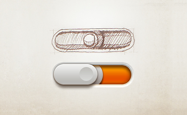
UI Parade – I stumbled upon UI Parade a while ago and it has really helped me with ideas and perspectives on the appropriate interfaces to use. They provide a huge list of examples, anything from Nav Bars, to buttons, to drop downs, to sign in forms. Sometimes it helps to just skim through and get ideas on various looks and feels. (Tip: pick on, open your favorite design tool and commit to making your own copy of the visual you just picked out. It’s fun!)
Inspired UI – Here you will find an exhaustive list of all the mobile designs you can imagine. It’s a great place to go when you are evaluating in the early stages what you want your mobile interface to look like and how it should function. Trust me, you will definitely be inspired.